Entries in illustration (7)

Wednesday
Jan262011

Anatomy of a Desk

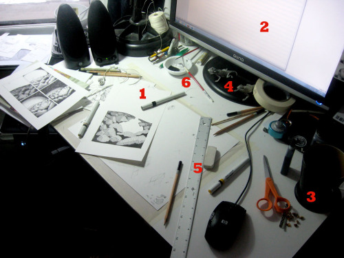
1. Rapidograph Pens (or, as an insightful and clearly experienced employee at my local art supply store called them, "pain in the ass pens"). I embrace tiny lines for the drawings and need tiny pens.

2. Music, podcasts or other narrative noises. For this project, I purchased a 19 hour audio book on Siberia. Both informative AND bleak!

3. Snack. Note the mug of tea and the neatly clustered stems that were once a pile of delicious dried figs.

4. Horny Toad Paper Weights (a wedding gift from my Texan father). Standing in constant vigilance and silent judgment if I ever stray from my work to the tempting, if unfulfilling, world of the internet.

5. Metal ruler. For straight guide lines, though all lines are ultimately inked free-hand.

6. Tiny cup for ink & brushes. For filling in larger areas of the drawing. Since I over-control everything, the preferred brush is the miniscule size "00."


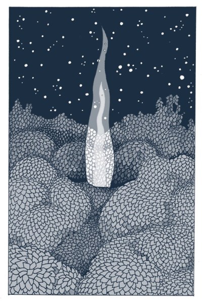
Fortunately, this set up is working well. I have completed the first page of the book, a minor miracle after so many weeks of hemming and hawing, and now I am barreling forward into the second with full abandon. This is a welcome change: I had been circling my work with complete frustration for a good month, throwing every hour I could spare towards working on this book with no satisfying results. After venting complaints last week to a few trusted ears, 3 people in the same day asked me what I thought the illustrations should look like, if the current drawings were not "it." For the life of me, I was baffled: I realized I only had negative definitions of what it shouldn't be, and a few unhelpful and vague ideals in the positive ("lush" comes to mind). I looked at inspiration images I'd gathered, I paged through favorite books, browsed the sites of inspiring artists, and realized that my "ideal" was some impossible, contradictory mixture of everything. Gouache paintings and etchings, silk screen prints and pen drawings and digital illustrations all were muddled in the back of my mind as ideal styles. This realization was liberating, and I set to work on drawing the way that I know how to draw, not echoing or aspiring towards an impossible ideal.

And so I return to work; the horny toads are looking at me.
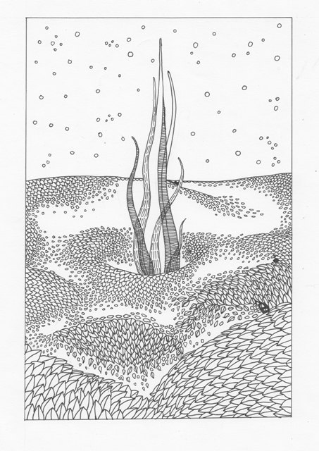
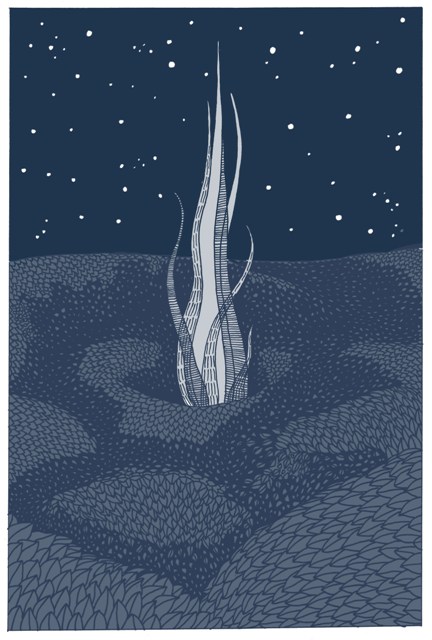
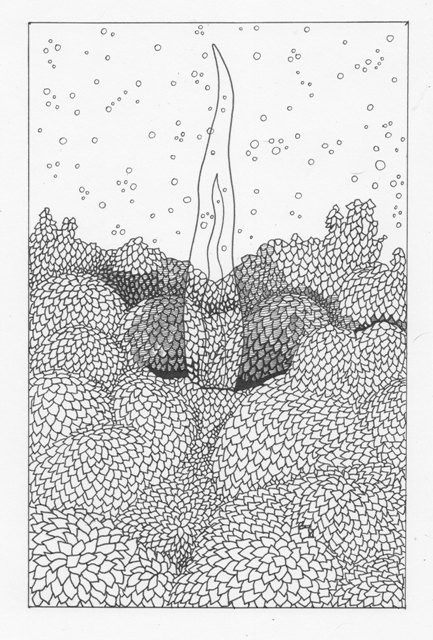
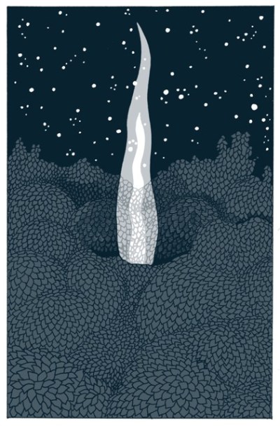
 

Sunday
Jan162011

More Tests

Have you ever been caught off guard by how personally relevant a movie can hit when you thought you were just watching for fun? Either you have subconsciously chosen movies that you knew would poke and prod at a raw wounded spot, or perhaps that you would find a relevant sub plot in any movie you watched. I remember one evening a few years ago when I was struggling with an institutional bureaucracy that I was a part of was making decisions I disagreed with. I was torn up, trying to find the courage to do the right thing. What did I end up watching, completely unintentionally, to escape my worries on a particularly hard night? Catch-22. Brilliant. When that was too heavy, I changed to a "let's lighten up the mood" second movie, Harry Potter and the Order of the Phoenix. Fun, light-hearted wizardry, right?

Hey, Dolores Umbridge! How're things up there with Colonel Cathcart?

Today was one of those days. After a week away from my book project, I was excited to have two and a half uninterrupted studio days with nothing to do but work. I sewed two more binding test mock-ups, which helped me decide the paper I will print on and the final dimensions of the book. I drew a few more pages of character tests and chapter-heading tessellations before moving on to designing rough plans for the two main locations in the text, a warehouse/work space and a small gaff-rigged sloop. Feeling confident, I sketched out the page design for the first section (/chapter) of the book and thought what the hell, I'm on a roll--I'll start the first page!

Cue the movie for back-ground noise while I draw: Exit Through the Gift Shop.

I spent a happy two hours working on the first page, a view from over an expanse of trees with smoke rising out of a clearing. I just drew the outlines of what I could later fill in quickly in Photoshop.

I was pleased as punch with the drawing, but as I played around in Photoshop the image started to look less and less like I'd imagined. I added some more details, re-scanned it and tried my hand again:

No. Just...no. The fire looks like tentacles, the difference between what I drew and what I filled in was too obvious, and the more I considered it the less I liked the way I drew the leaves, which is really the selling point of the drawing. I'm sure if I had the interest or patience I could have worked and re-worked the image in Photoshop, but I'm a neo-luddite woman at heart and couldn't feel like it was an image I controlled if it needed that much modification; I'd rather start back from the ground up.

Meanwhile, Mister Brainwash is selling his Banksy/Warhol hybrids that his staff made for tens of thousands of dollars. What am I doing with my time?! He gets rich hyping artifice; I toss the work and start over.

No need to get mopey! I decided to put on a light-hearted farce, something that has nothing to do with the art world: The Money Pit fit the bill. There's no way a story about people starting a project bigger than they can handle that literally collapses on them could have any immediately personal metaphoric meaning, right?

...

New drawing!

New leaf style; denser drawing to keep from having to rely on Photoshop fills; less tentacle-y smoke. That's a bingo! Time to play in Photoshop:

So much better, but still not done. My aesthetic preference for the dense and ornate will be the end of me: I prefer the shaded leaves that were supposed to define the space behind the smoke to the open leaf design. Time to pull the drawing out of the scanner, put on another pot of tea and get to shading more of the page.

Here lies Walter Fielding. He bought a house, and it killed him. 

I feel you, friend.

Edit from Tuesday:

New attempt?

Page 1 2