Entries in printmaking (12)

Tuesday
Sep132011

Summer Round-Up

It has finally happened: the high temperatures later this week will dip in to the upper 50s, pumpkin-flavored everythings are available with irritating regularity at coffee shops and bakeries city wide, and citizens everywhere are discovering orphaned gloves and single cough losenges in newly aired-out jackets. Summer is over and fall is settling in!

We here at Monkey-Rope Press are settling back into a long-overdue work flow after a heartily enjoyed summer hiaitus, but that's not to say that we've been without news:

  • Earlier this month, Chicagoist and Gapers Block picked up on our CTA Announcement print series. Any and all publicity that hilariously modulated voice acting can get, the happier we are! 
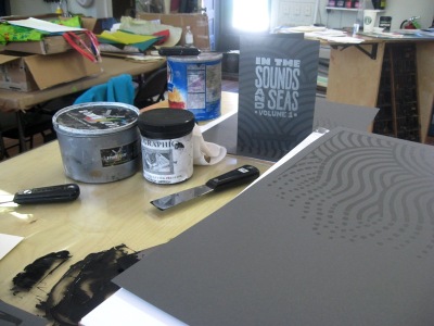
  • The first chapter of Monkey-Rope Press's first graphic novel, In the Sounds and Seas, is now available at both Quimby's here in Chicago and at Comix Revolution in Evanston. If those are too local for you, the book is also available on our etsy store.
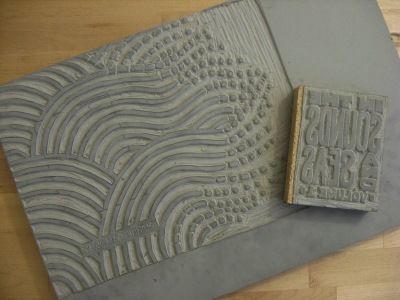
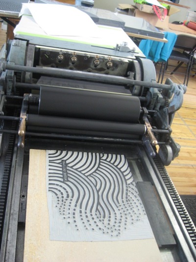
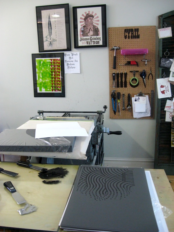
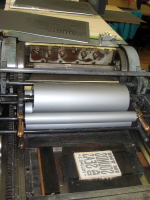
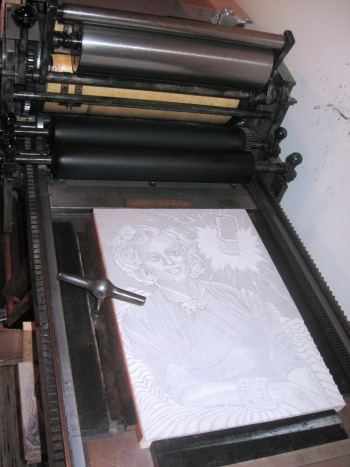
  • Last but by no means least, we printed wedding invitations for beloved pals, fellow nerds and sociology PhD candidates this summer. I offered to print their invitation before I knew what they wanted, and couldn't have been more tickled or excited by their idea. Who needs cherry blossoms and cursive script when you can have gigantic robots destroying the Las Vegas strip?

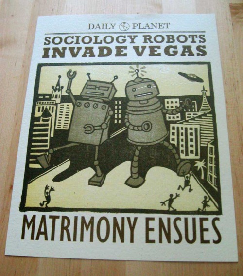
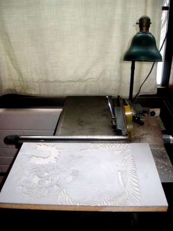
This brown, cream and metalic-bronze linoleum block print was printed on Cream Cordtone Speckletone French Paper on a Vandercook 4 proof press at Evanston Print and Paper Shop. Unfortunately, Las Vegas was not damaged in the production of this print.

Looking forward into the coming layering seasons, we look forward to adding new prints to our shop page, publishing small experimental comics and settling into Chapter 2 of In the Sounds and Seas. Now it's time to put on a kettle for tea and settle in to business. Happy autumn, one and all!

Friday
Jun172011

Printing the Cover

Linoleum block relief carvings for both the cover pattern and text

The first color: half and half black and sliver ink for a muted-metalic grey, on French's Dur-o-tone Steel Grey paper

First color printed...and look at what's on the wall! Way to go!

(Many thanks to Evanston Print & Paper for accomodating our last-minute press needs.)

Metalic silver ink for a popping title

The first trimmed-down mock-up of the cover of In the Sounds and Seas (vol. 1 of 6).

This afternoon I drop off the cover stock to Salsedo Press, who is offset printing the text block of the book and folding/coallating the press pages. For the first time in 6 months, this project will be out of my hands. I reckon that means it's time to get started on volume 2 this weekend!

Wednesday
Mar022011

A print in its natural habitat

A few months ago an old acquaintence--librarian, bibliophile, friend of the book arts and all-around swell lady--was passing through town and purchased my personal favorite print, Johannes Gutenberg says Way To Go!  It was a lovely reconnection, and though I was sad to see her leave, I was happy that a beloved print was finding its way to a home where I knew it would be appreciated with the same balance of earnest geekery and flippant irreverence that I intended.

This morning my email was graced with a printerly update: the Gutenberg print in its new home! I'm sure everyone else appreciates how (intentionally) funny the placement of the print above the home inkjet printer is. 

Way to go, Louise, and thanks for the update!

Sunday
Dec052010

Printing Process

After a festive day at Renegade yesterday, I spent an early snowy morning at the studio finishing the first half of the Christine Jorgensen diptych. 

First I trimmed the block on the studio's table saw. This is a wonderfully lazy method: without a saw I could have carved out the extra several square inches on the block, but why put my finger joints through that when better tools are available? 

Next, I locked the block into the bed of the press. A few pieces of chipboard are cut to match the dimensions of the linoleum block and packed in underneath, to bring the surface of the linoleum to type high (that is, the height where the rollers will hit the block). The carved block is kept in place with long blocks of wood (called furniture) and a quoin, which can be expanded to snugly lock in the furniture and the block by rotating the quoin key.

Then I mixed the ink. For consistency throughout the full run of this project, I kept the ink mixture as simple as possible so I can closely match it again in the future. I bought a can of purple ink and mixed it half and half with opaque white. 

After inking up the press, I pulled a first proof on scrap paper. This is always an exciting moment for me as a printer, to finally see the result of all the hours of carving labor hunched over at my desk.

But that isn't to say that the carving is done, or that the block is ready to print! The first proof is on the left, and the final print is on the right. I saw from the spotty, lightly textured first proof that I needed to add more chipboard under the block to raise it up high enough for even contact with the inked rollers. I also err on the side of leaving too much not carved, so that I can cut more away once I see how the block prints. Looking at the proof I decided that I did not like the wimpy-looking "electric" movement out of the microphone, so I improvised some more cuts for a more balanced & bold look.

Then all that was left was to print the full edition. I printed 60 for a final edited edition of 50, giving room for me to take out of the run any prints that were under-inked, gunky or imbalanced in some way.

And there she is!

Thursday
Dec022010

Block finished!

The Christine Jorgensen block is complete! Check in early next week for the first finished print of the history series collaboration with writeyourprincipal.com