Entries in typography (3)

Friday
Apr062012

Pavilions and Summer Sunshine: Spring Wedding Invitation #3

I am proud to share the third and final of this season's hand-carved, hand-printed wedding invitation prints! The couple gave me delightfully free reign to design their wedding invitation, with no limitations or guidelines beyond a few modest typographic preferences. They are very thoughtful people, and shared that they are moving through the wedding planning process striving to strike a balance between political awareness and social responsibility as they get married at a time when not all citizens have that freedom, and wanting to have a ceremony and reception that would be joyful and celebratory of their love and commitment. 

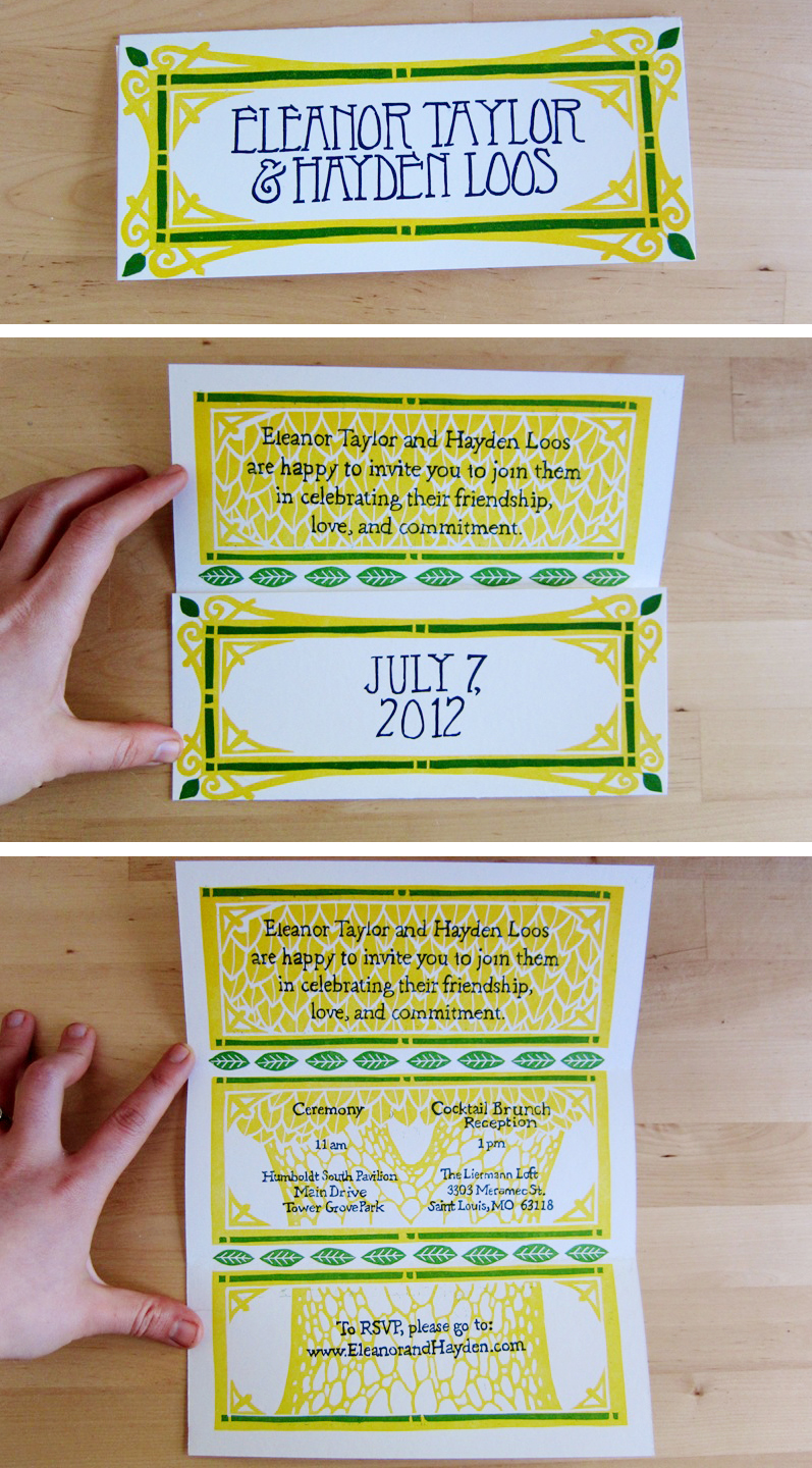
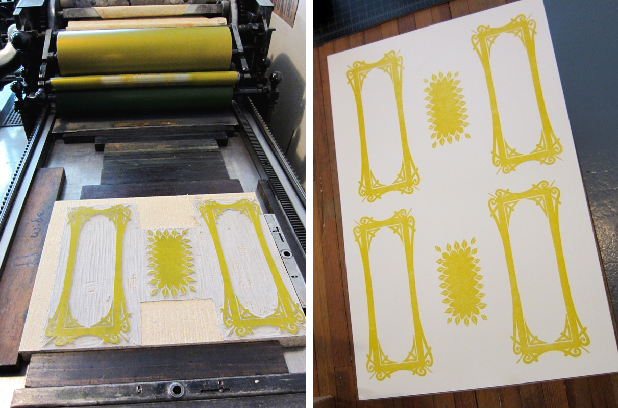
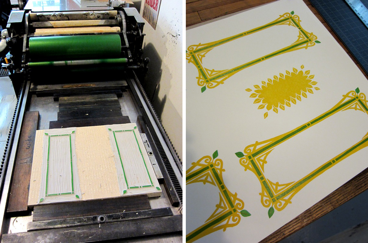
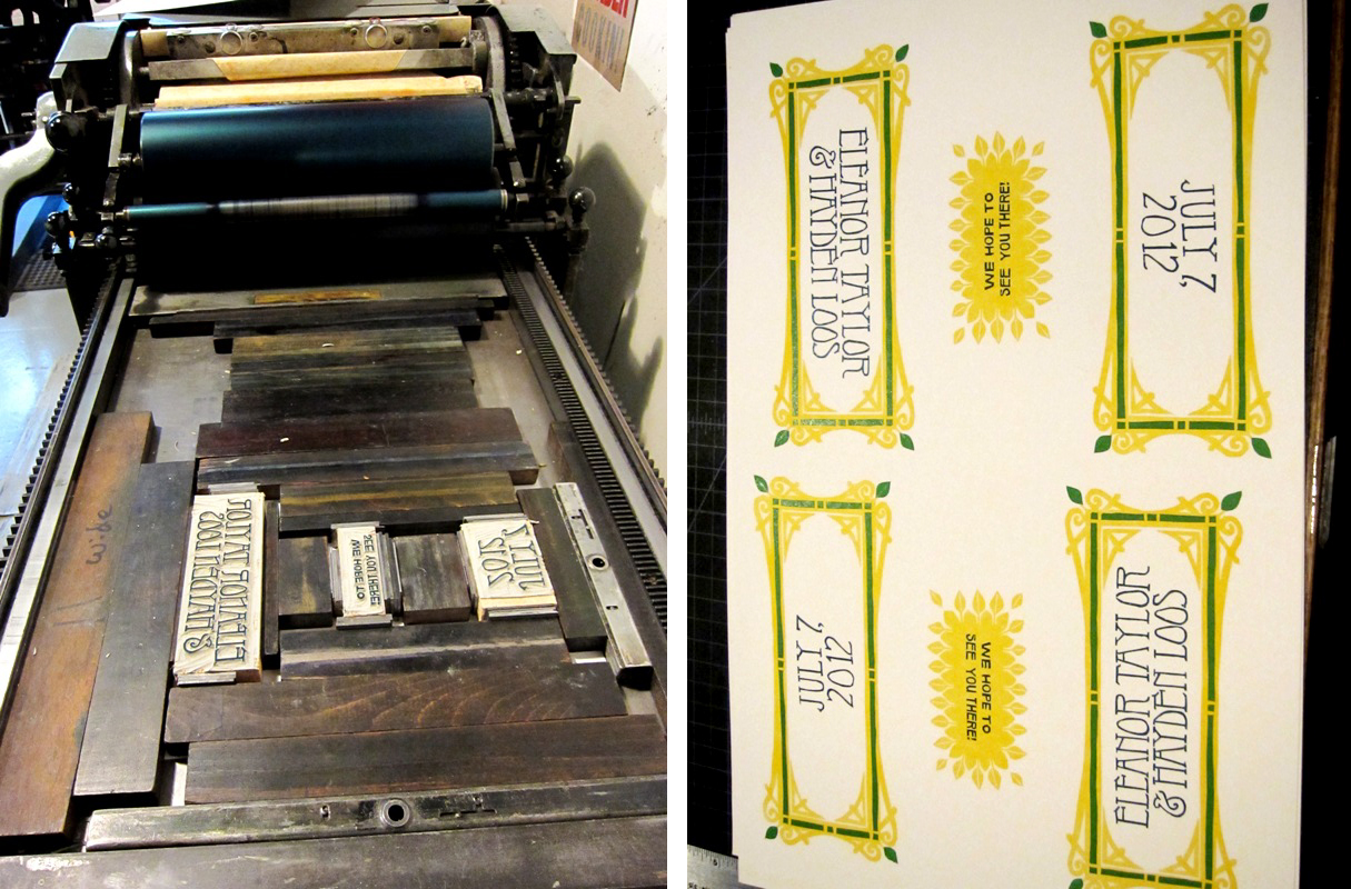
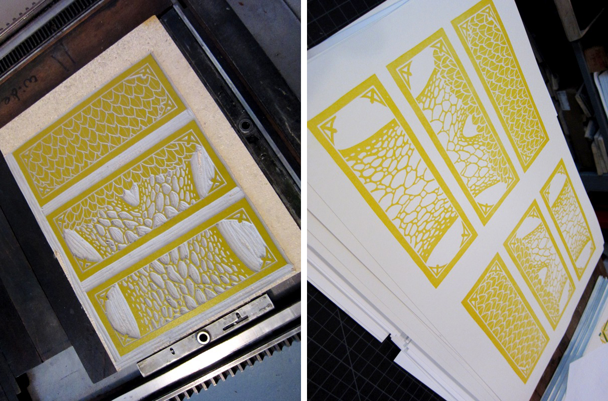
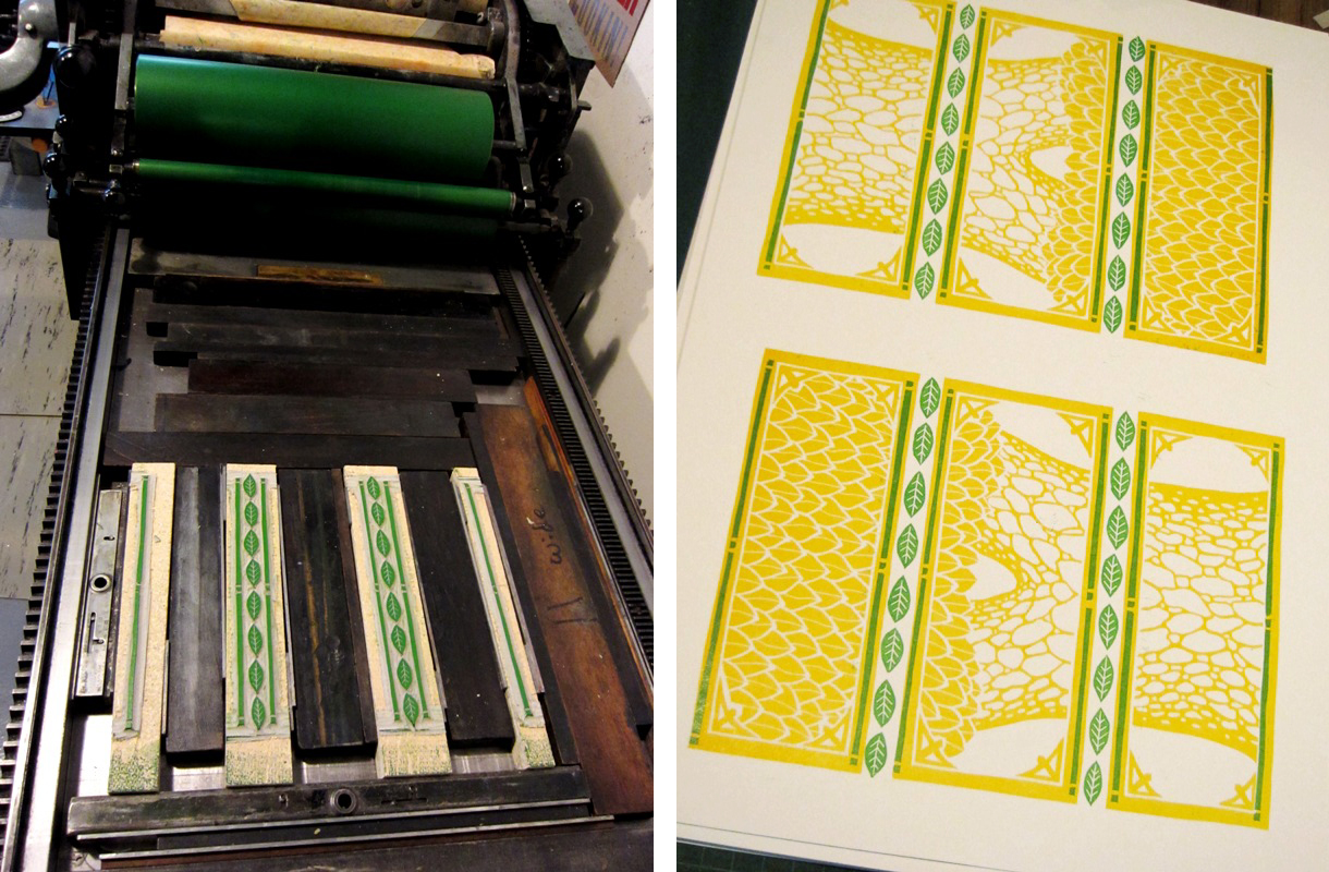
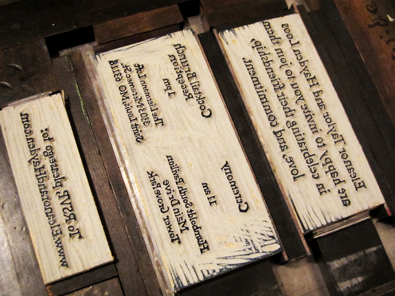
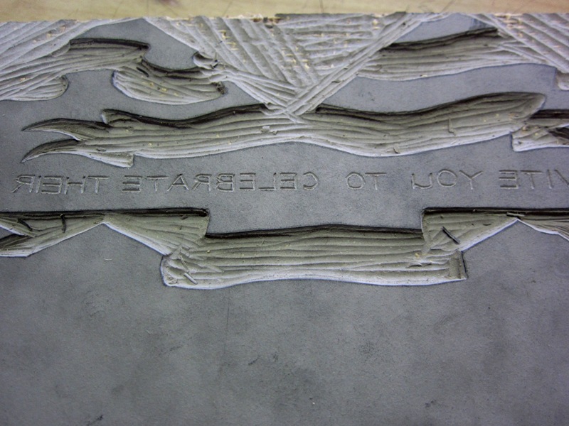
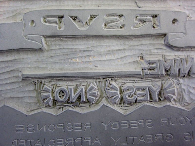
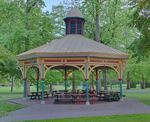
With this highly personal spirit in mind, I incorporated decorative elements from the beautiful late-19th century park pavilion where they are getting married for the opening panels of the trifold design, which opens up to a bright tree behind the ceremony and reception details. The warm mustardy yellow, green leaves and blue text were summery fun colors to work with, and I was tickled to have the opportunity to challenge myself with the folded design and small serif type to carve. I couldn't be happier with the end result, and I wish Eleanor and Hayden all the happiness in the world!

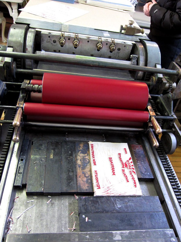
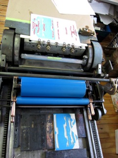
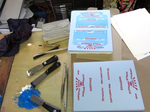
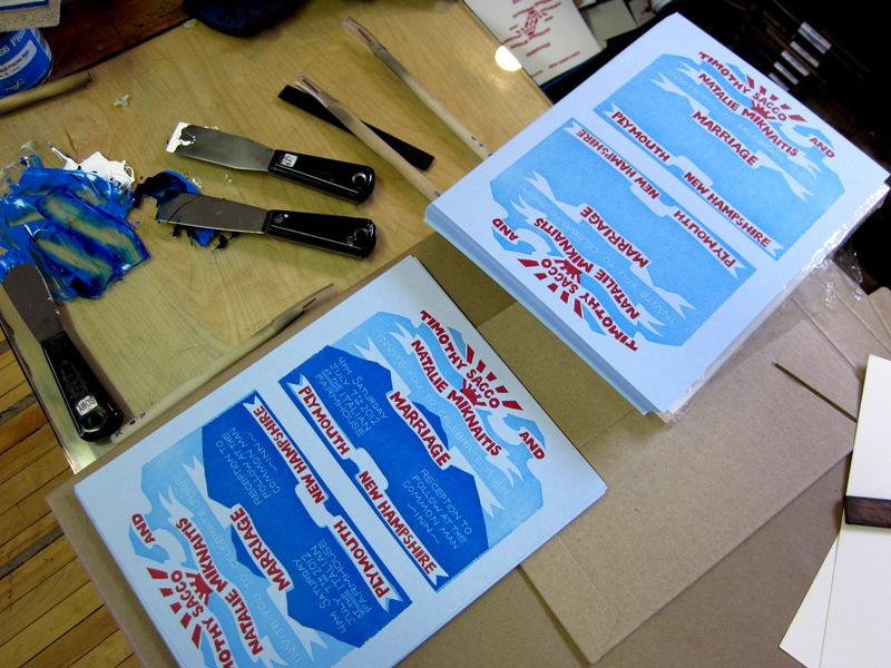
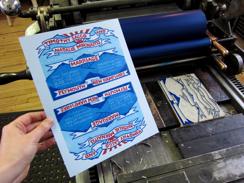
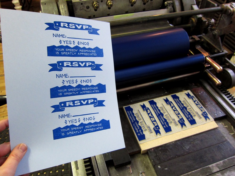
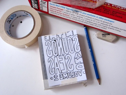
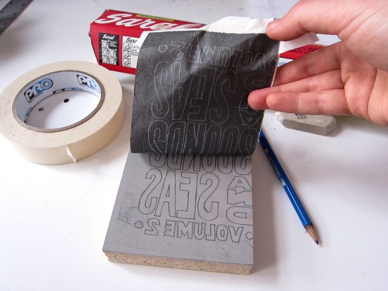
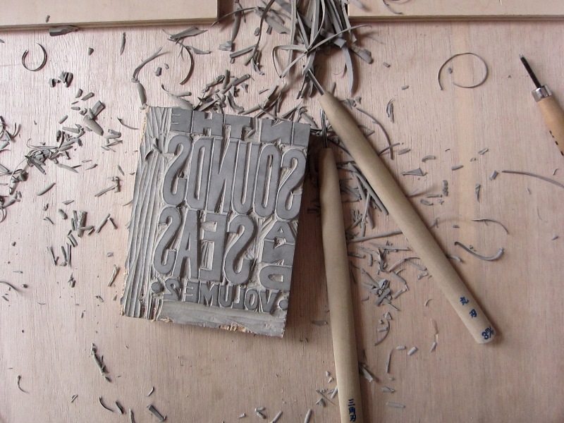
This 8.5" x 11" tri-fold invitation was printed at the Starshaped Press studio on a Vandercook proof press from hand-carved linoleum blocks on French cover stock paper. Designed, carved and printed by Marnie Galloway. April 2012.


Monday
Mar052012

Mountains and Banners: March Wedding Invitation #1

Although the bulk of the business at Monkey-Rope Press is artist-driven prints and books rather than commissioned work, I readily admit that I really enjoy working on wedding invitations. I am reminded of a friend who has worked an absurd diversity of jobs--from fixing cages at a chicken factory to moving furniture for the military, and now as a college professor--who said his favorite job was his year working as a flower delivery man. He loved getting to spend his whole day making people happy. Who isn't delighted to receive flowers?

Similarly, it is a pleasure to get to bask in the ambient happiness that surrounds the planning of a wedding. The couple who commissioned this invitation are avid hikers, campers and national park enthusiasts and, though they live in Chicago, they are getting married in their home town in full view of the beautiful mountains of New Hampshire. I was excited to get to use these elements in designing the print.

These 5" x 7" four-color invitations and 3" x 5" RSVP cards were printed at Evanston Print and Paper Shop on a Vandercook proof press using hand-carved linoleum blocks, including hand-carved text. The print process went smoothly, with only a slight registration hiccup when I discovered that one of the linoleum blocks was not cut straight. I put a few lead slugs on the corners to twist the uneven block so I could lock it up square; the fix worked, and I could move forward without a second thought. (Every printmaker is a secret MacGyver.) I'm very proud of how it turned out. All the happiness in the world to Tim and Natalie!

Next week is March Wedding Invitation #2, a 5-color, 2-sided 8.5" x 11" poster!

Tuesday
Feb142012

Volume 2: So close!

Printing the cover of Volume 2 this weekend and sending the files to press next week. Not ready for a victory lap yet, but it is exciting to see the finish line!